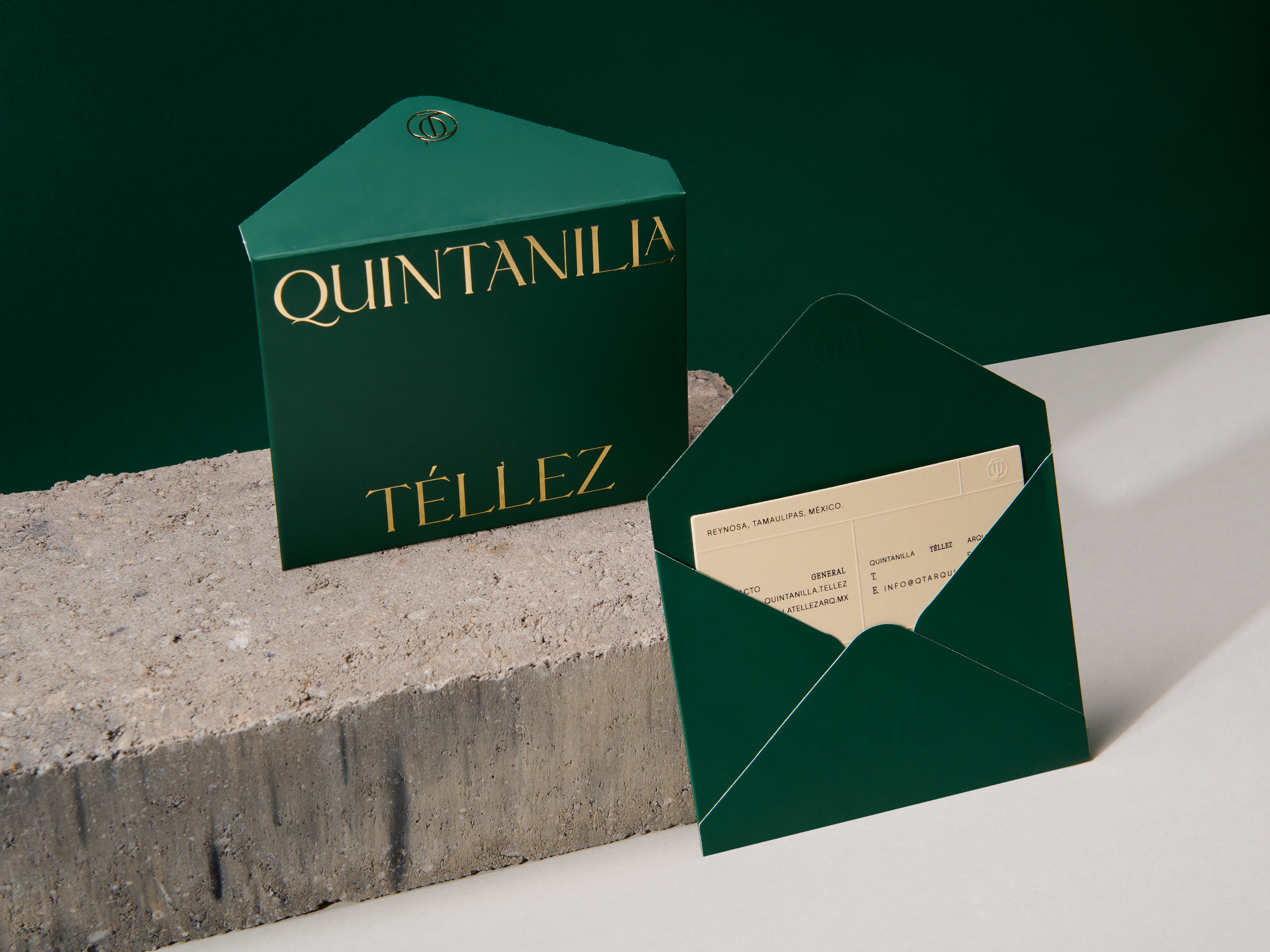
Saludines
ESP.
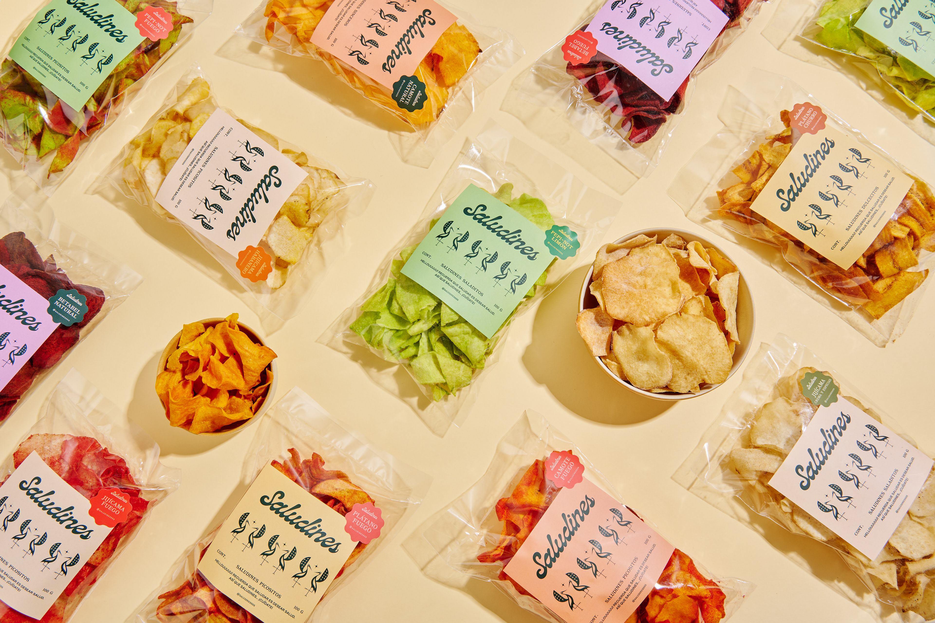
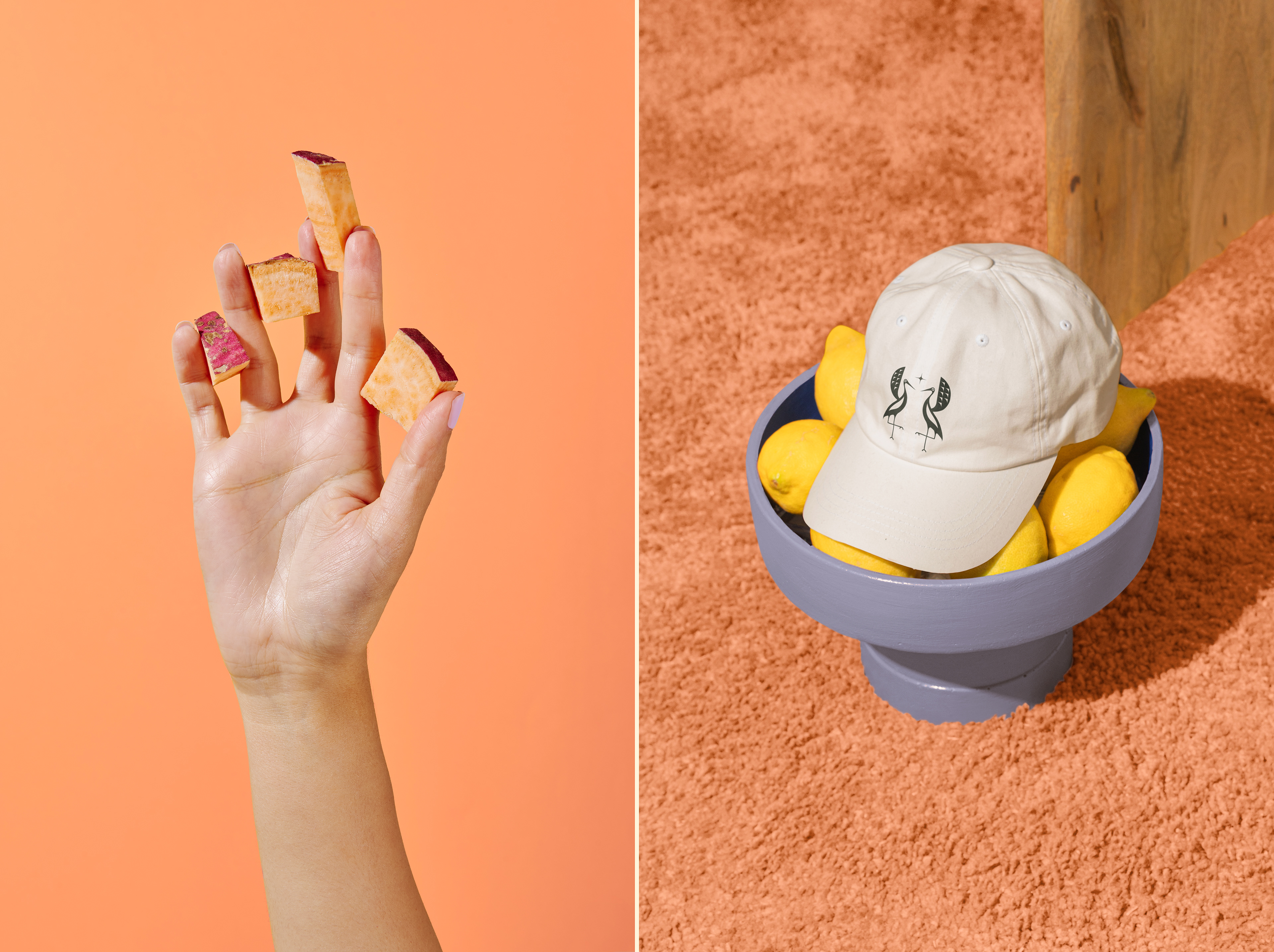
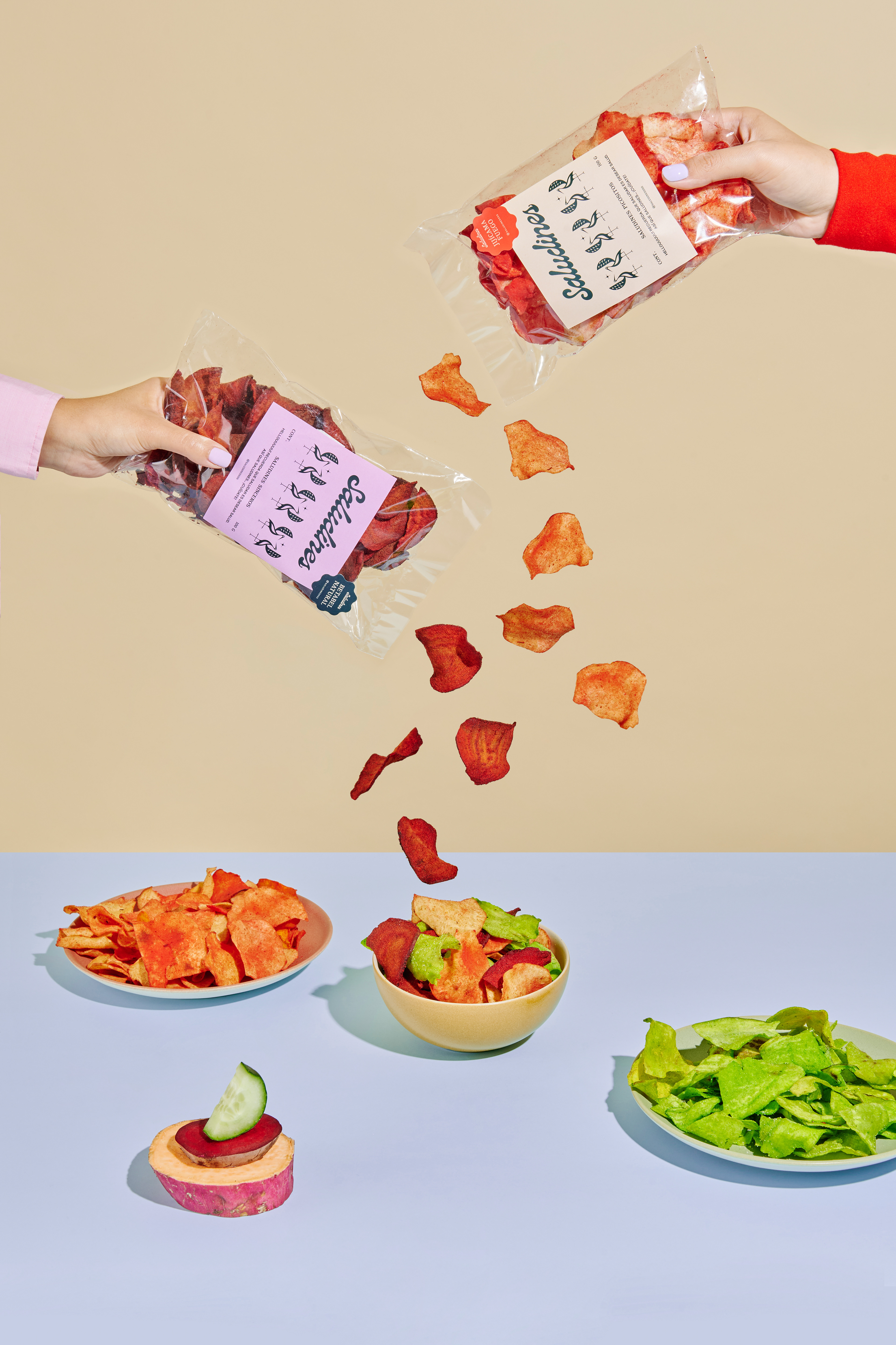
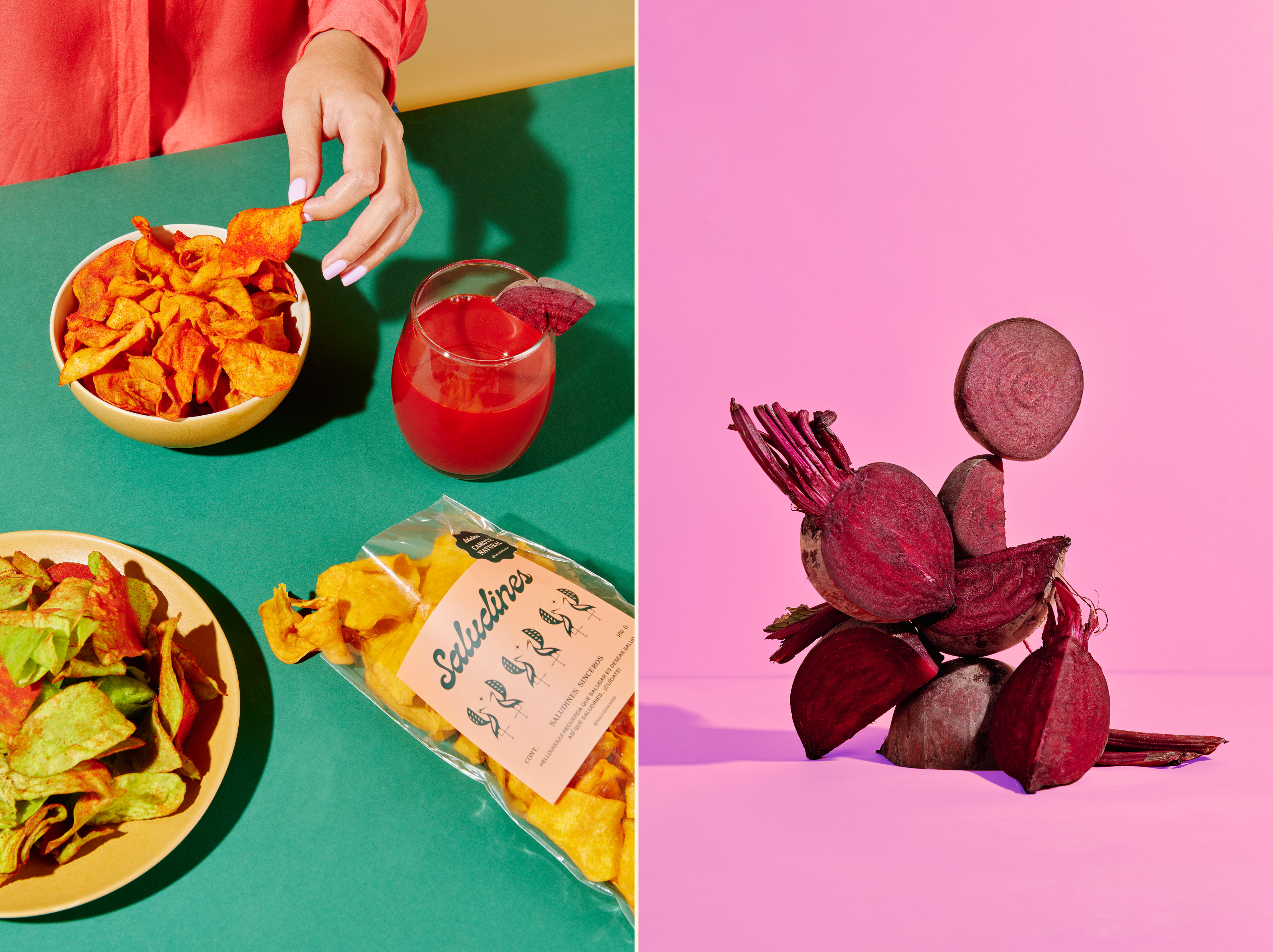
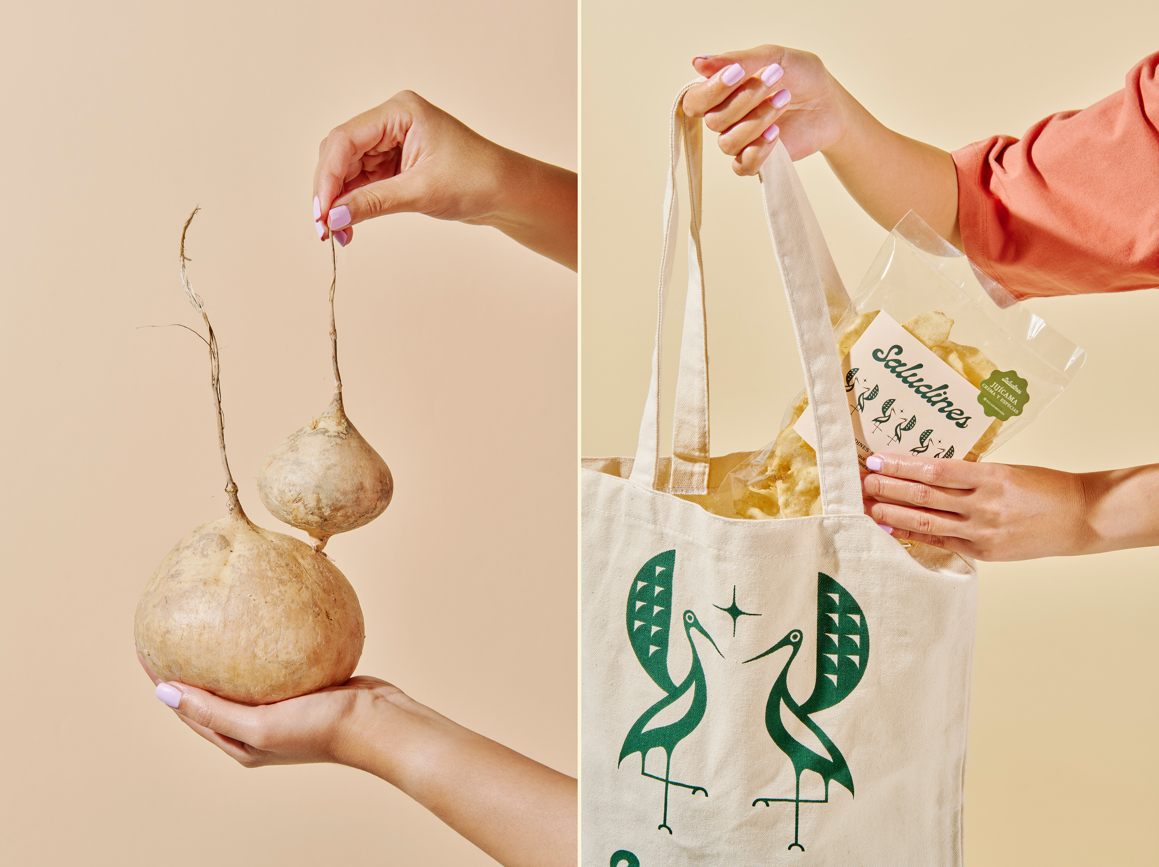
Saludines es una marca de snacks saludables (chips de frutas y verduras). Por eso nace de una idea simple: Saludar Es Desear Salud. A partir de esta asociación, el proyecto buscó construir una marca cercana, alegre y llena de energía, capaz de transmitir bienestar desde un lugar humano y cotidiano. Más que hablar de nutrición, la identidad propone una actitud: una forma optimista de relacionarse con los demás y con uno mismo.
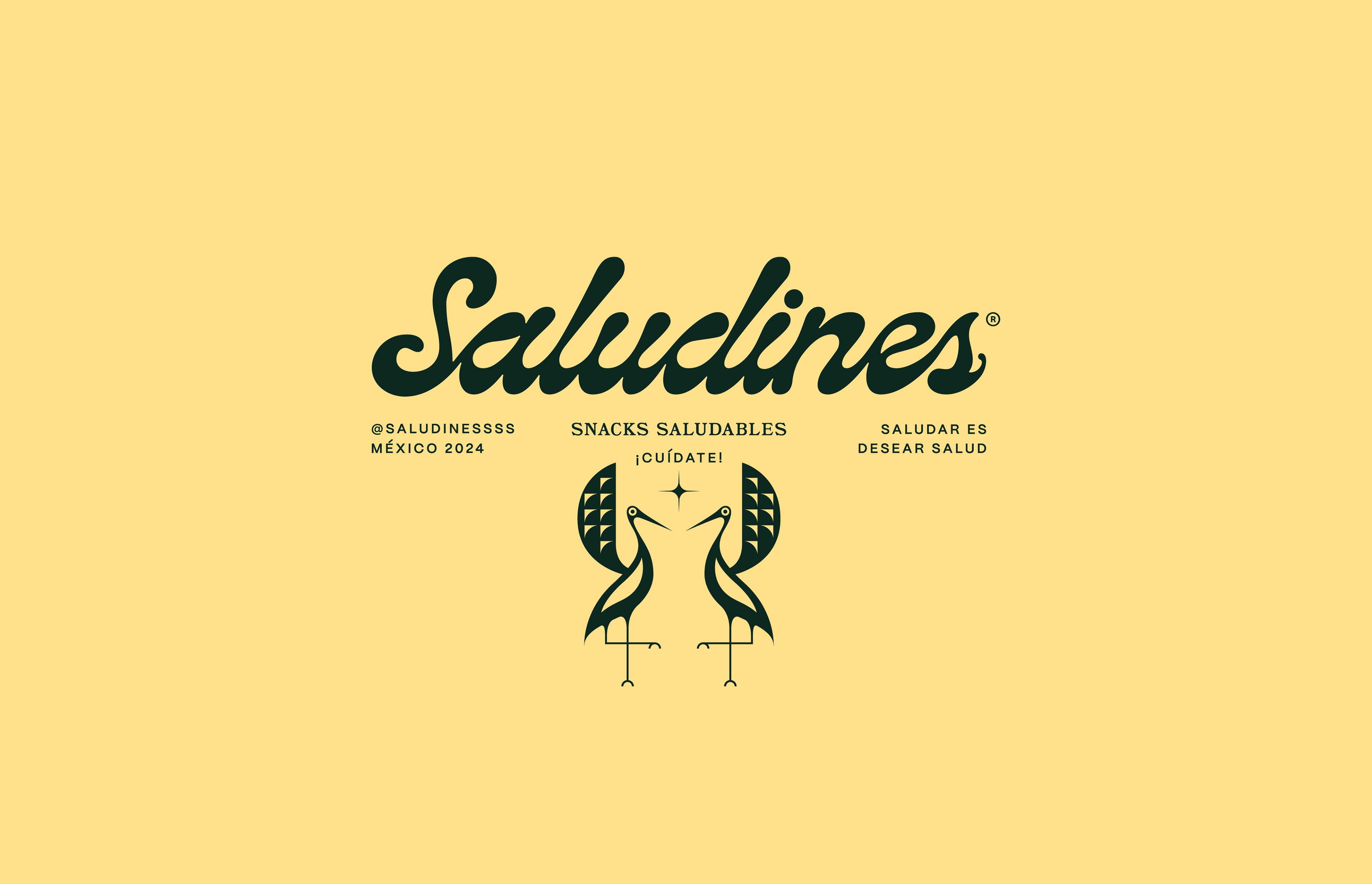
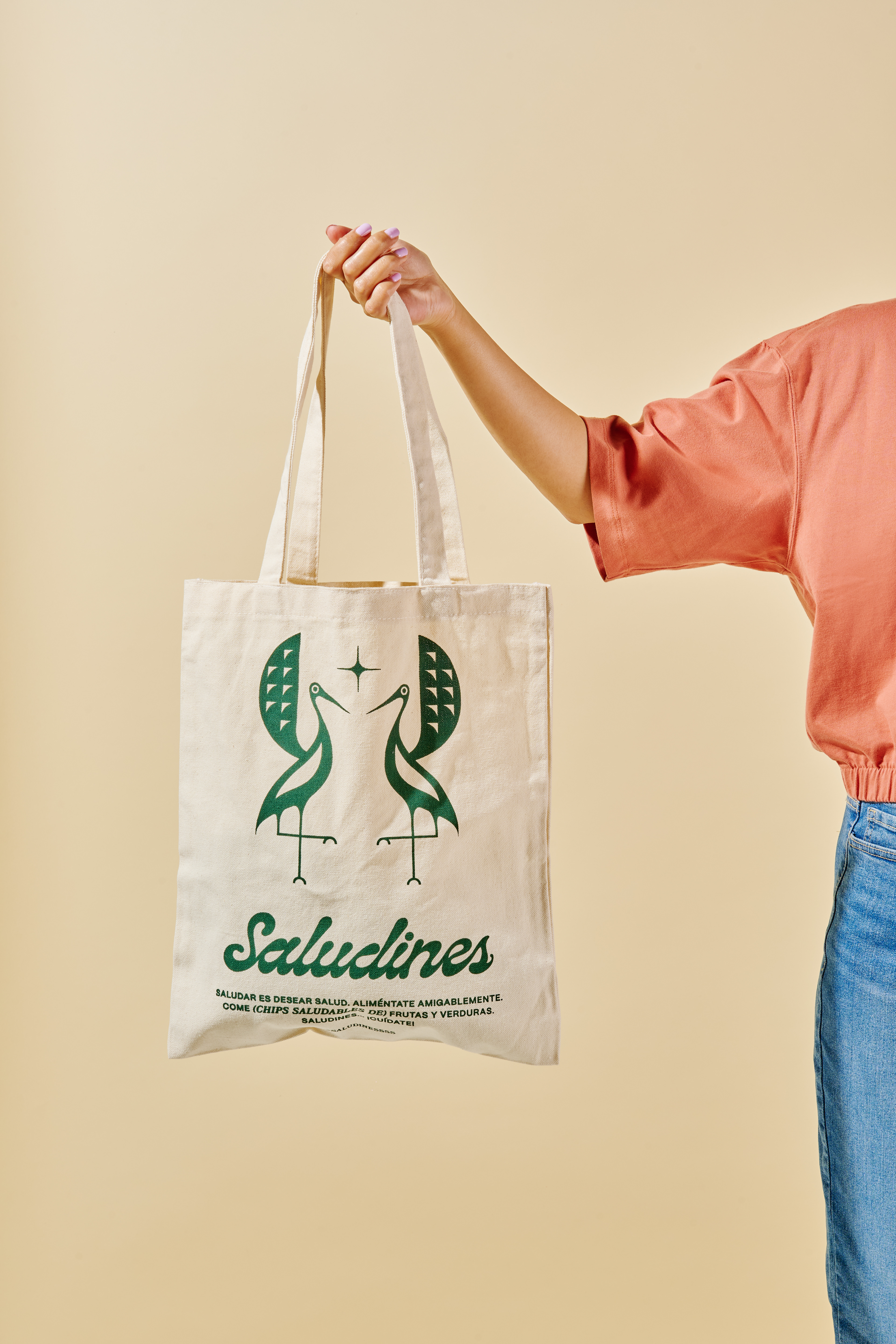
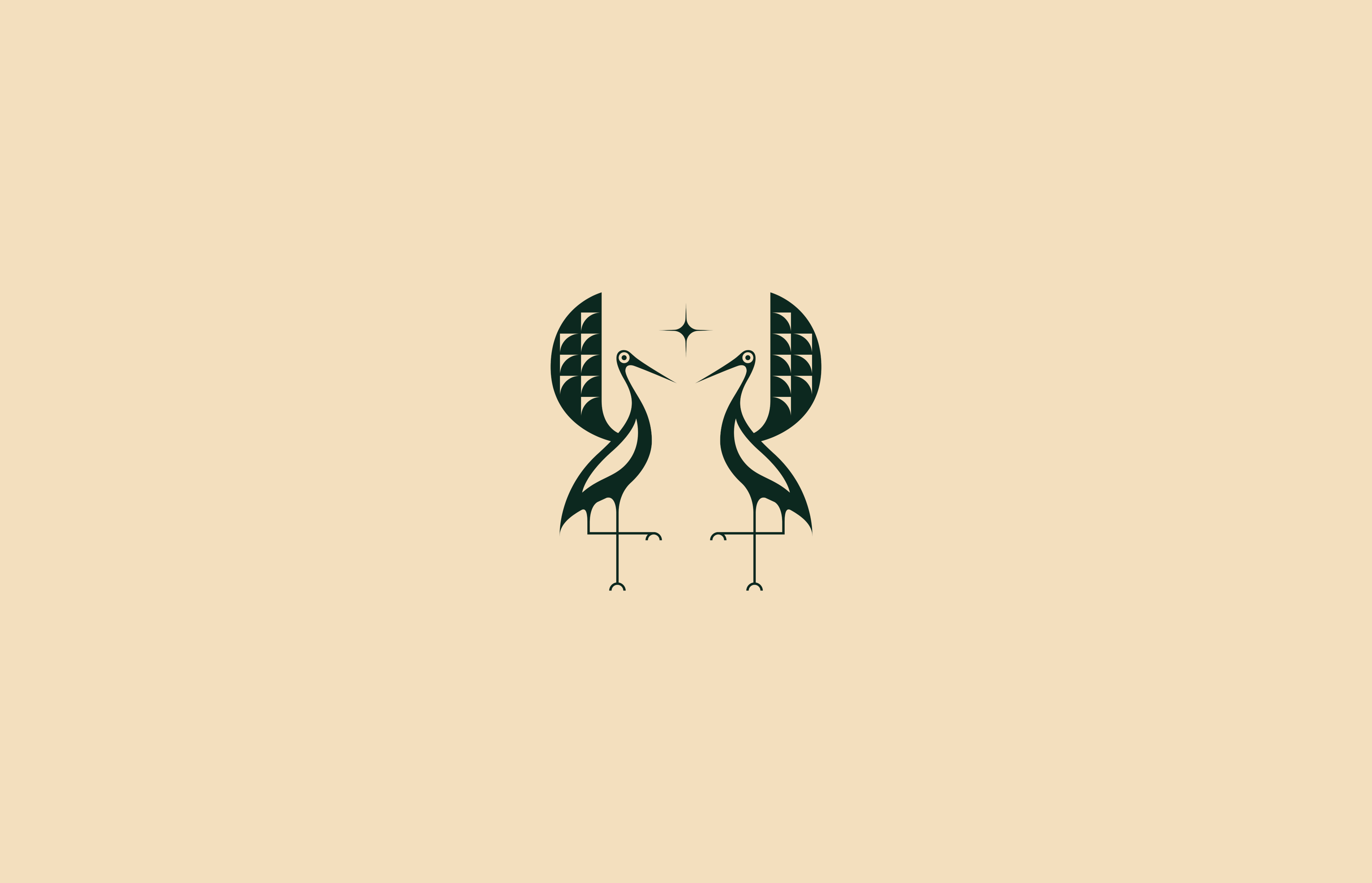
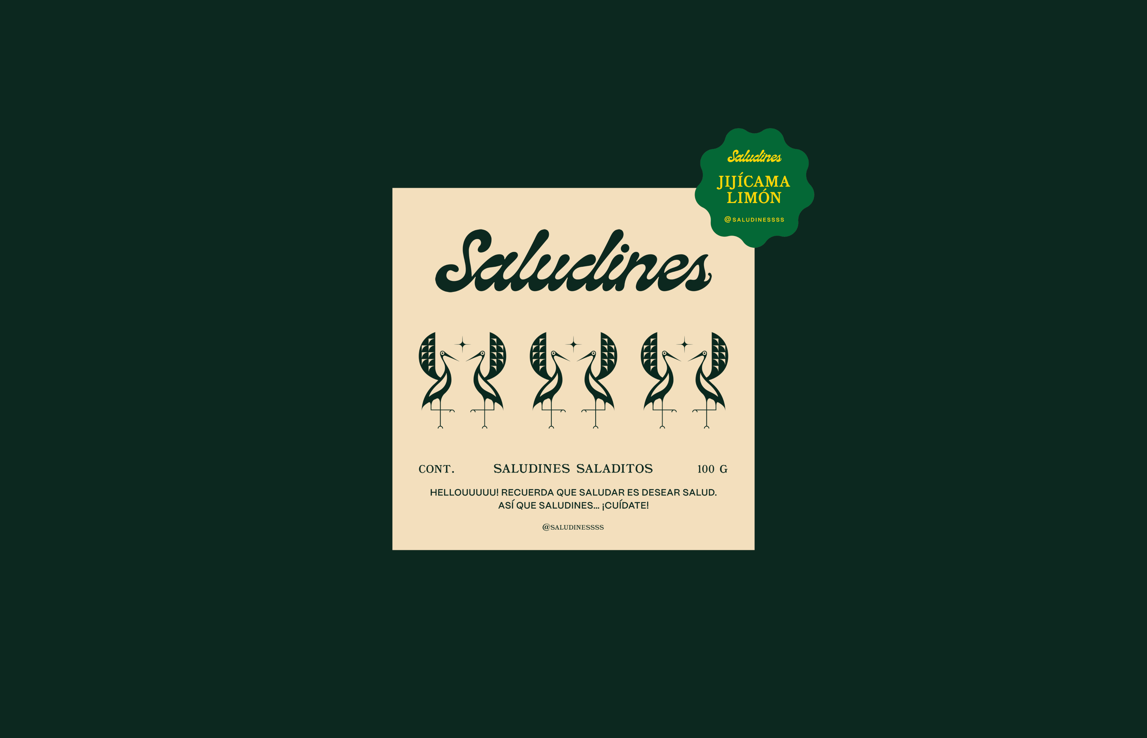
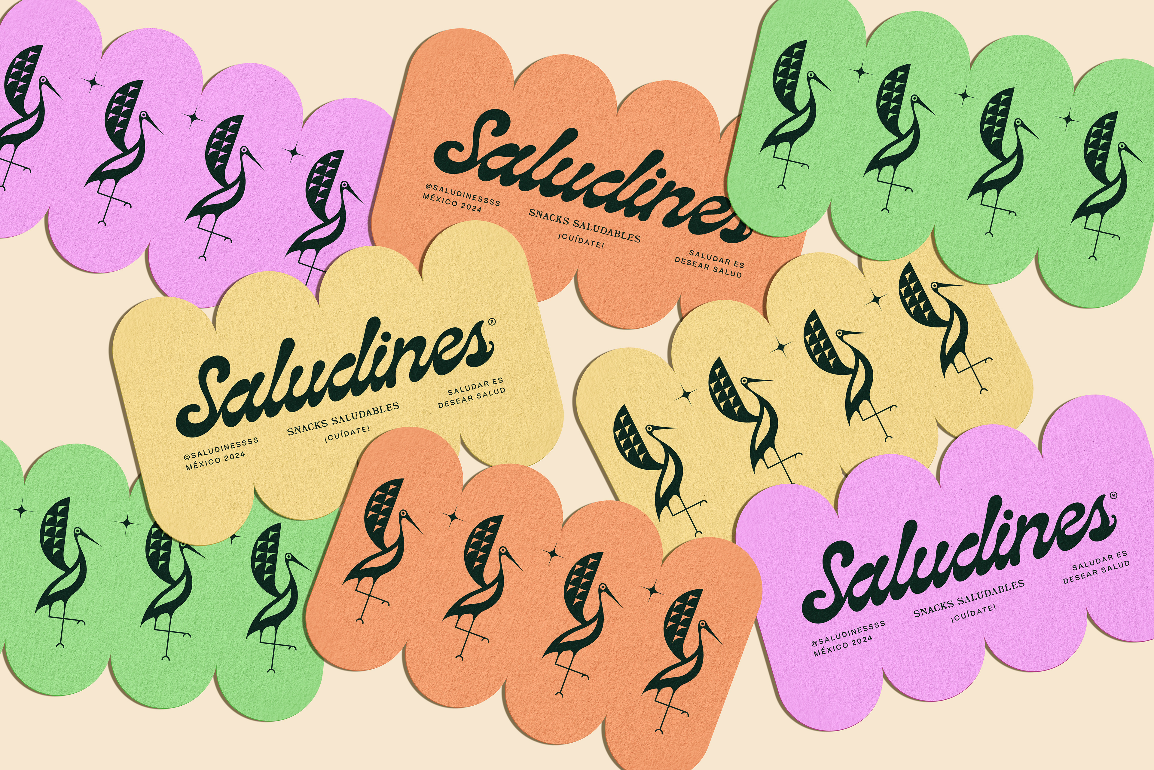
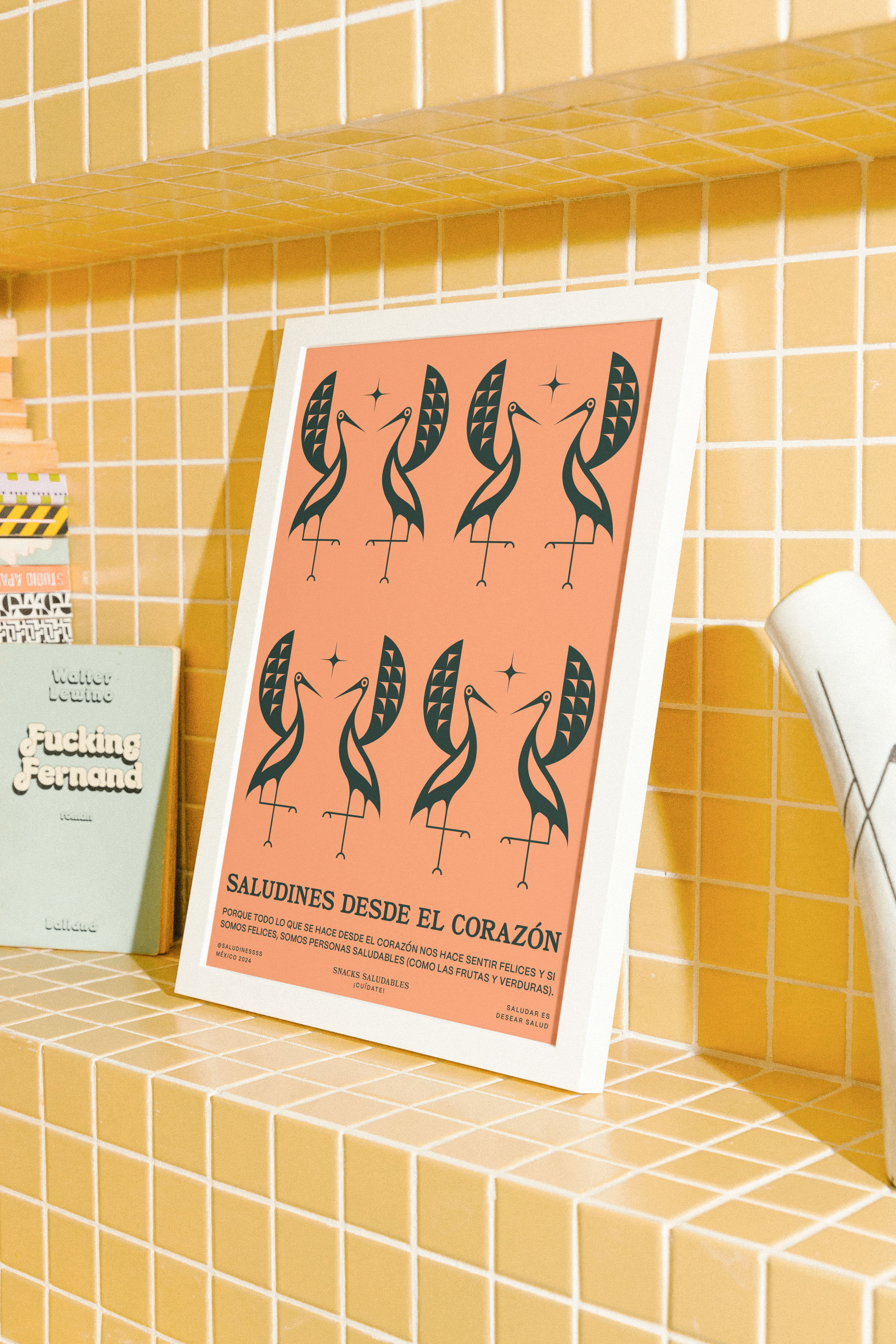
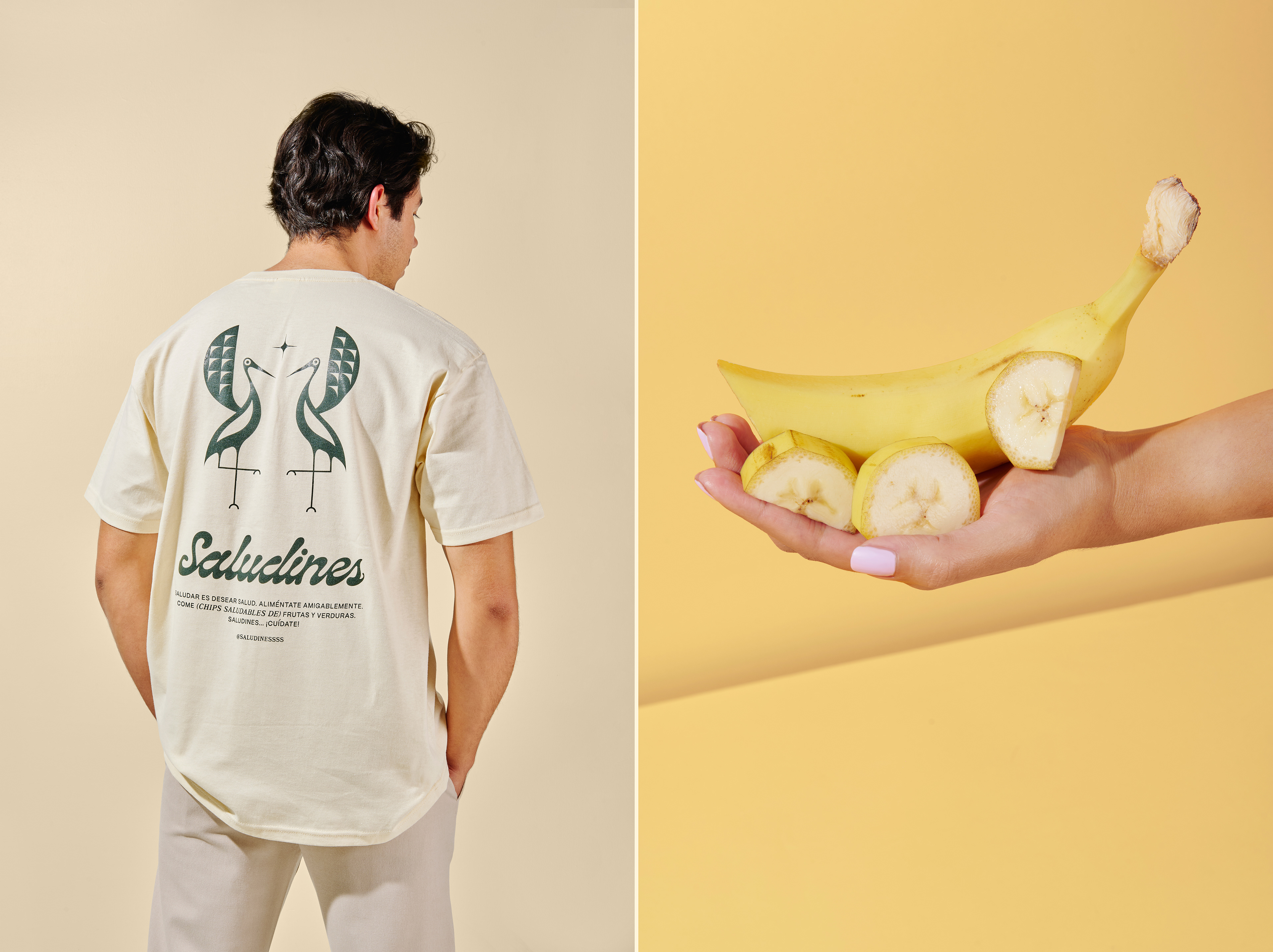
El logotipo adopta una escritura fluida y expresiva que aporta cercanía y personalidad. Como elemento central, el símbolo surge de la síntesis de una garza en movimiento, una figura construida entre el gesto de un saludo y la ligereza de una danza. En el espacio que se genera entre sus formas aparece una estrella, entendida como un punto de referencia dentro del sistema: un elemento que puede representar una meta, una intención o simplemente una dirección, reforzando la sensación de movimiento que da origen a la marca.
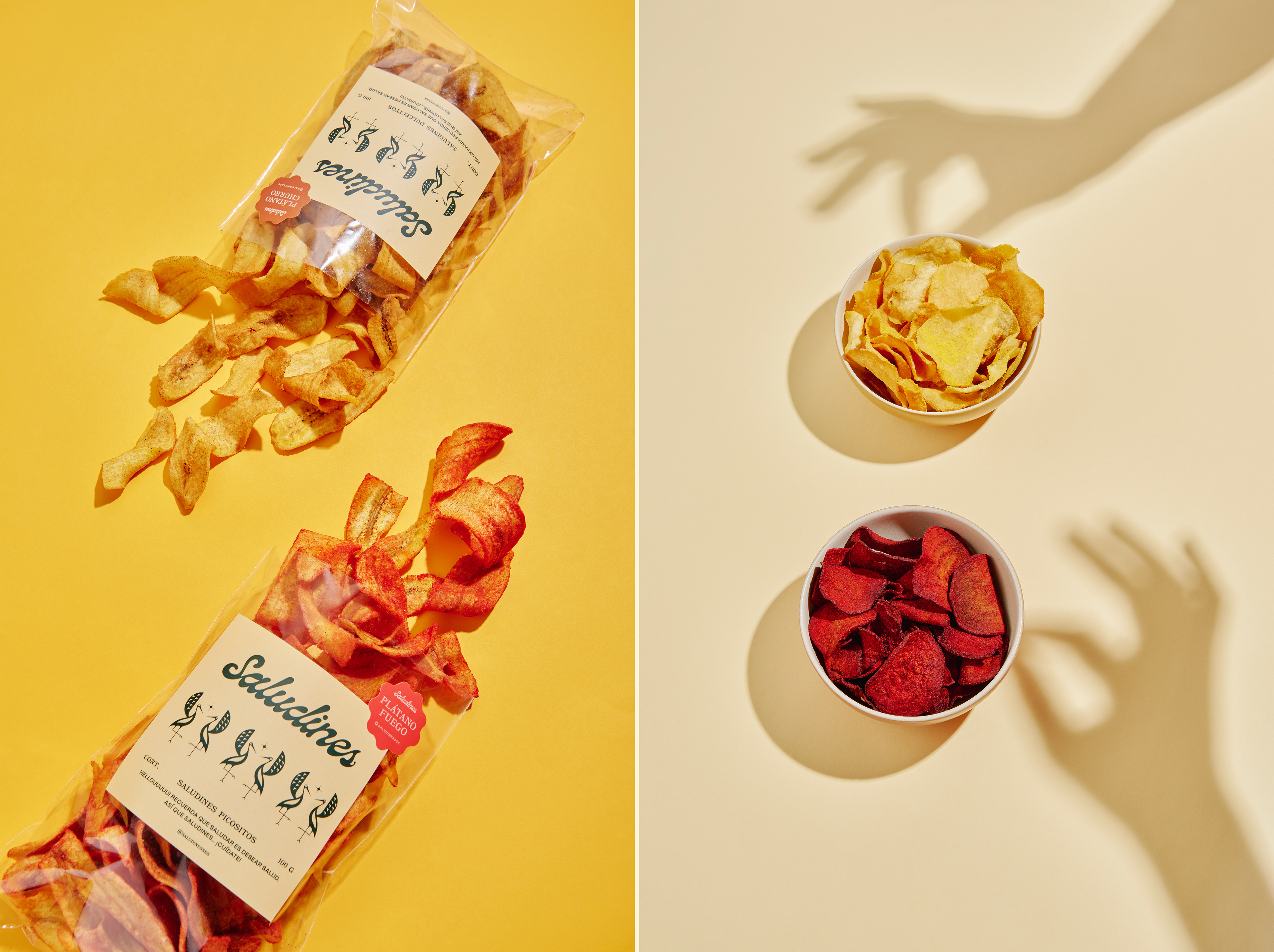
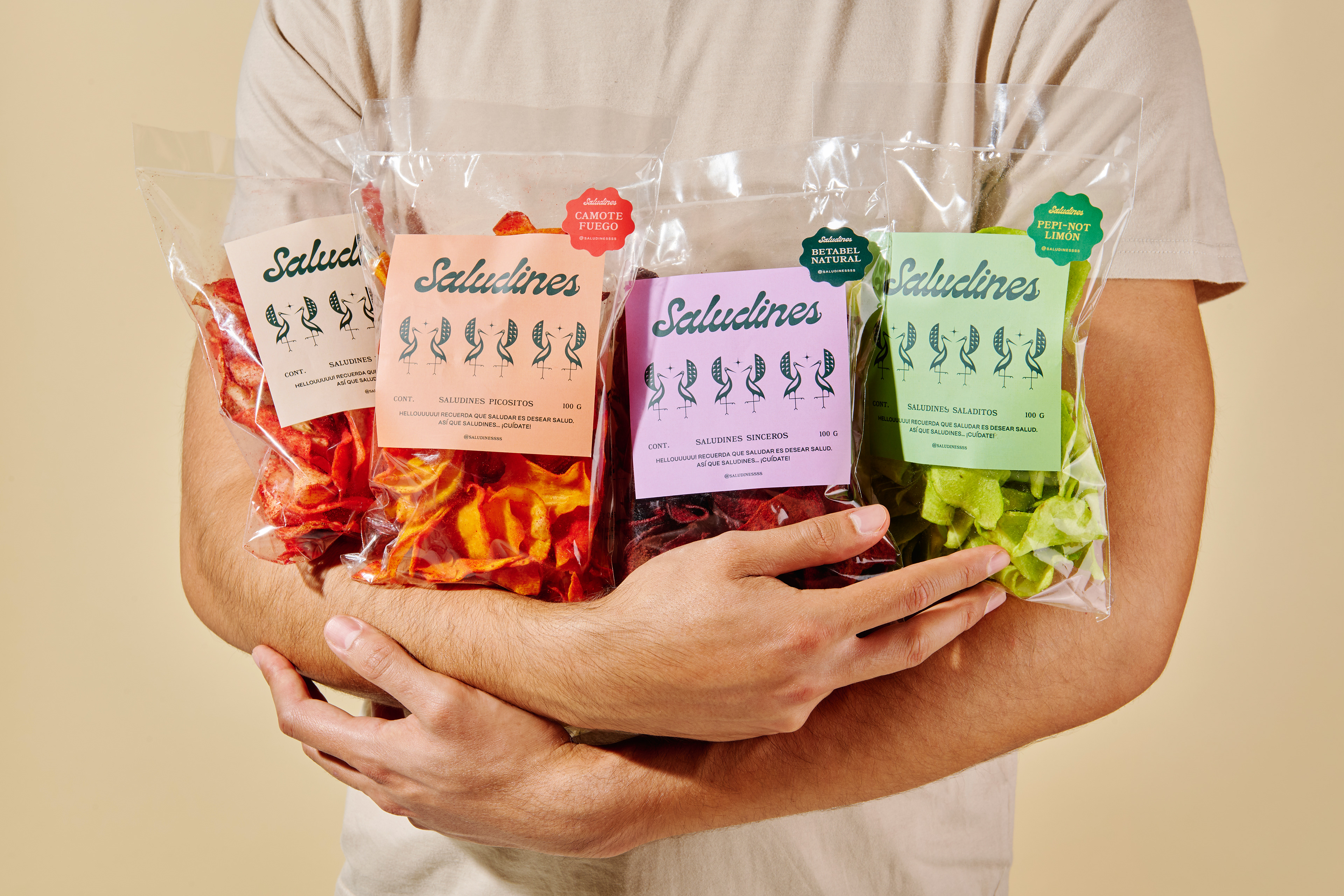
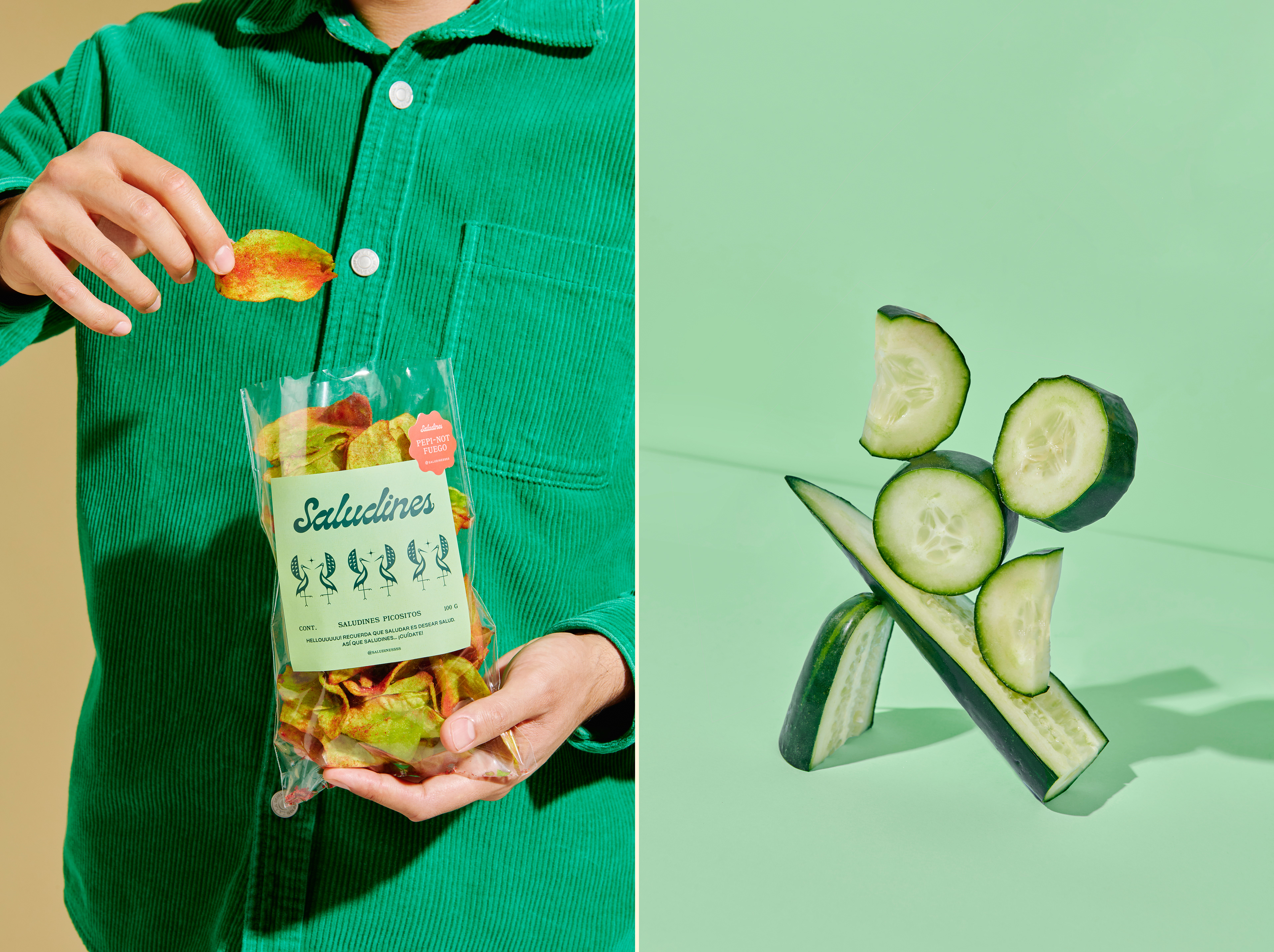
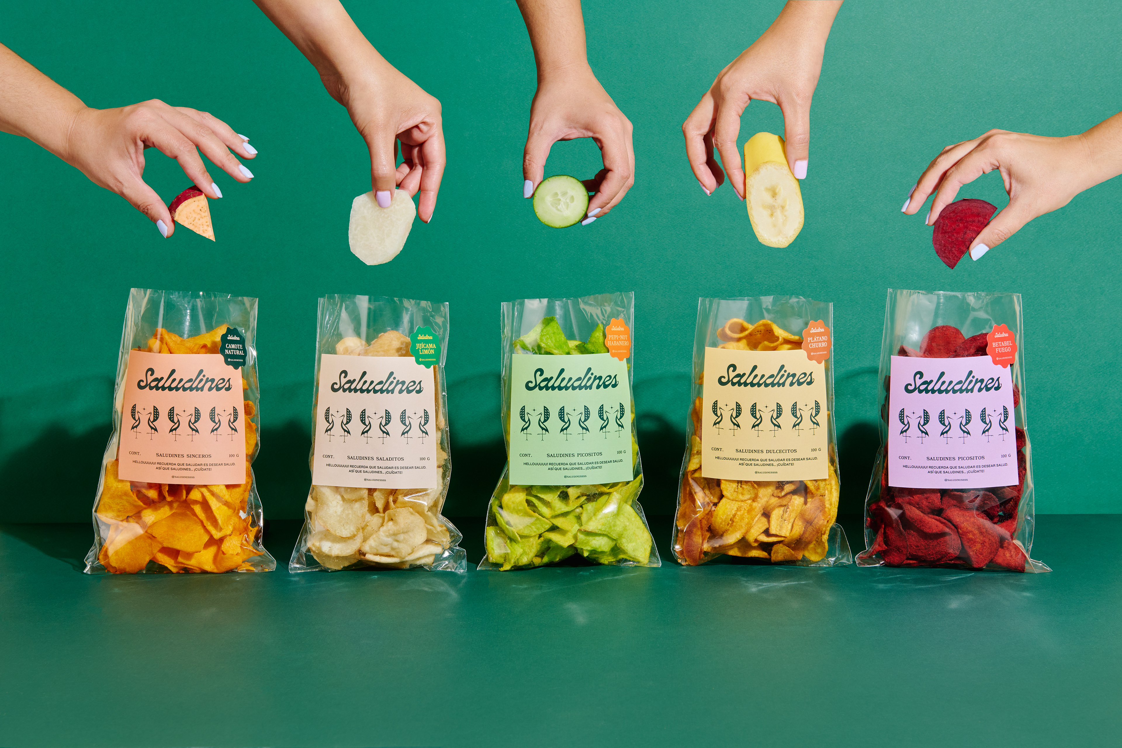
La paleta cromática combina tonos luminosos y frescos que aportan una personalidad vibrante y permiten diferenciar cada variedad de producto sin perder coherencia visual. Los colores se convierten en una herramienta fundamental para transmitir la energía y el carácter optimista que define a Saludines.
El resultado es una identidad amigable y memorable que encuentra en el movimiento, el color y la energía de un saludo su principal forma de expresión.
Saludines - Saludar Es Desear Salud
NAMING / BRANDING / COPYWRITING / PACKAGING / ART DIRECTION
Saludines
ENG.
Saludines is a healthy snack brand specialized in fruit and vegetable chips. Its name is inspired by a play on words in Spanish that connects greeting someone with wishing them good health. This simple idea became the foundation of a brand designed to feel friendly, joyful, and full of energy, communicating well-being through everyday human connections. Rather than focusing solely on nutrition, the identity promotes an attitude: an optimistic way of relating to others and to oneself.
The logotype features a fluid and expressive script that conveys warmth, approachability, and personality. The heart of the identity is a symbol inspired by the synthesis of a heron in motion, shaped through the gesture of greeting and the lightness of dance. Within the negative space created by its forms, a star emerges as a central element of the system—representing a goal, an intention, or simply a sense of direction, while reinforcing the movement that defines the brand.
The color palette combines bright and fresh tones that create a vibrant personality and allow each product variety to stand out while maintaining visual consistency. Color becomes a key tool for expressing the energy and optimistic character that define Saludines.
The result is a friendly and memorable identity that finds its strongest expression through movement, color, and the positive energy behind a simple greeting.
Saludines - Saludar Es Desear Salud
NAMING / BRANDING / COPYWRITING / PACKAGING / ART DIRECTION

Follow us on instagram: @navegantestudio
Photography: @tamayo_____ Postproduction: @lilianabarraza_
Photography: @tamayo_____ Postproduction: @lilianabarraza_
Naming & Copywriting: @conmidomisma